This past year, my father unexpectedly passed away. As I worked through grief, communicated with family, and handled the logistical tasks that accompany a death, I truly came to understand why many describe losing a loved one as one of the most difficult periods of their lives. The experience gave me renewed empathy for so many of our organizers who face loss and financial hardship in tandem, who struggle to pay enormous expenses while actively grieving their loved ones.
At GoFundMe, we’re constantly having important conversations about how we can better help community members who are fundraising in the most dire of times. What do these organizers need most from us in their fundraising journey? How might we bring more empathy to every product touchpoint?
These questions, among many others, eventually led to a tailored experience for our funeral and memorial fundraising category, the first of its kind at GoFundMe.
A more helpful way to create a funeral or memorial fundraiser
With a team of product designers, product managers, content designers, researchers, and engineers, we began a three-week design sprint to improve the journey that organizers take when fundraising for funerals and memorials.
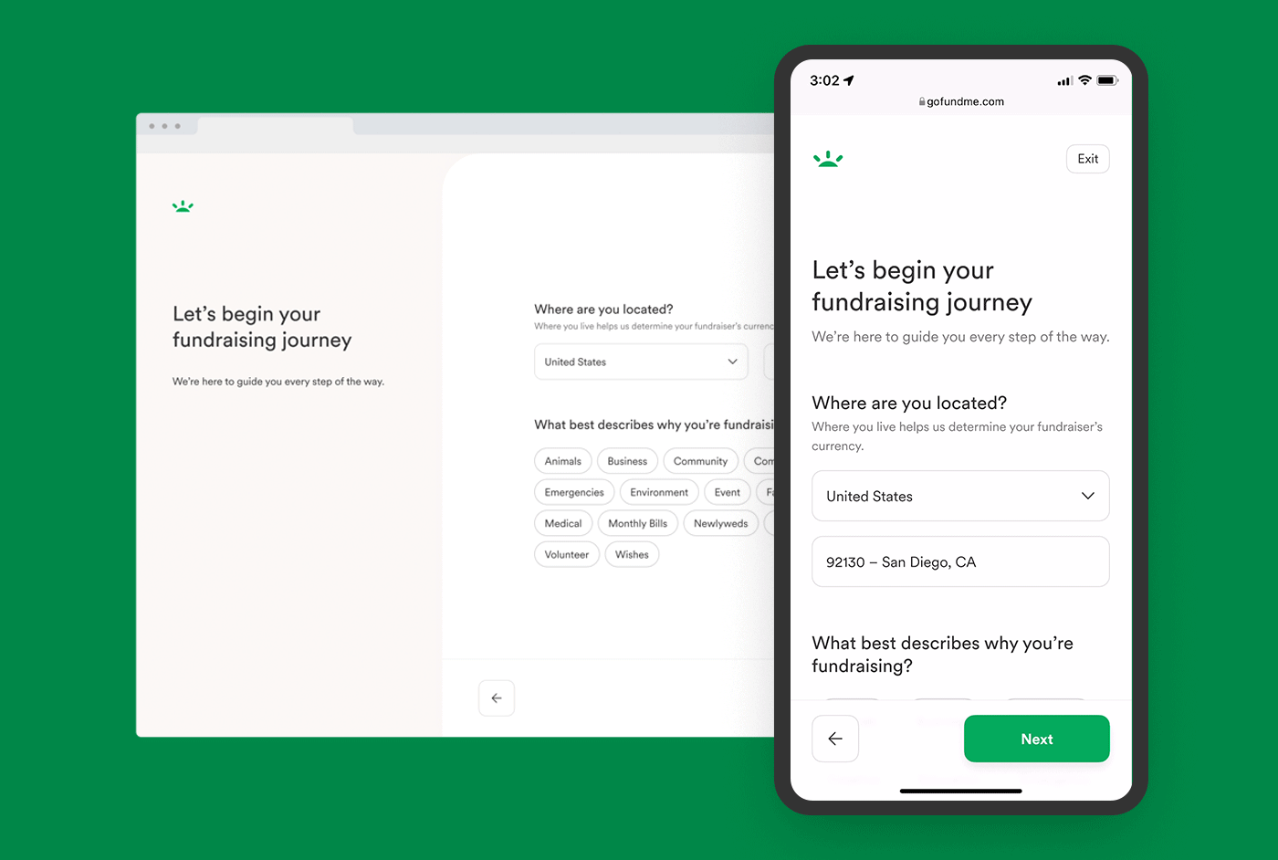
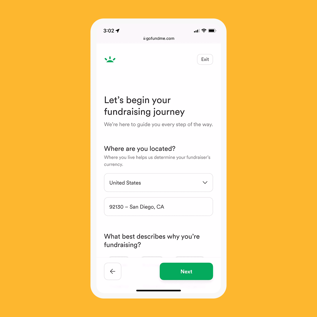
During the first week, we set goals, defined principles, and identified potential features through the lens of loss and grief. We discussed all elements of a funeral and memorial organizer’s journey from start to finish — from creating, publishing, and managing their fundraiser, to transferring funds to a bank account. Recognizing that getting started is often the toughest part of any task, we narrowed our focus to the fundraiser creation experience, our very first touchpoint with this group.
In weeks two and three, we dismantled our flow, using empathy and user feedback as our guiding light to infuse reassurance in visual, interaction, and content elements.
These were our design and content principles
- Recognize our organizers’ difficult situation and offer emotional support, reassurance, and help wherever we can.
- Give more autonomy and choice, making it easy for organizers to move forward, skip, and see their progress at any point.
- Create transparent, helpful guidance and recommendations that ease the burden of creating something new during a stressful time.
What does empathetic design look like?
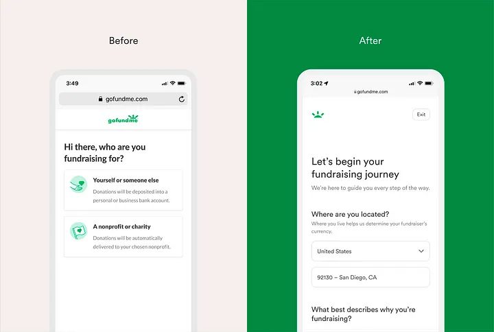
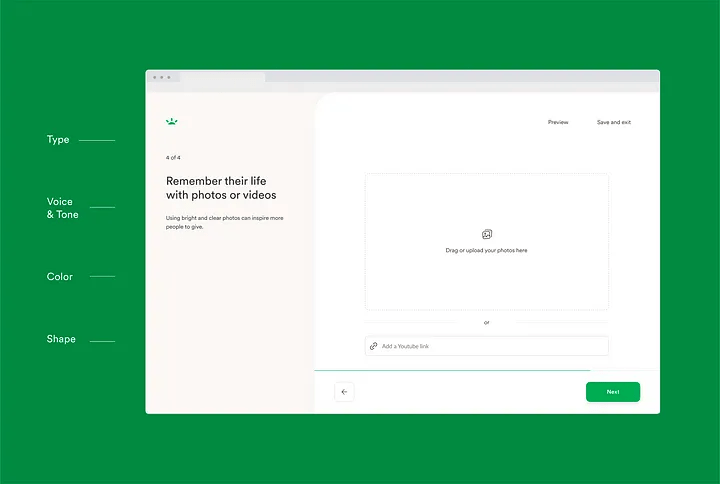
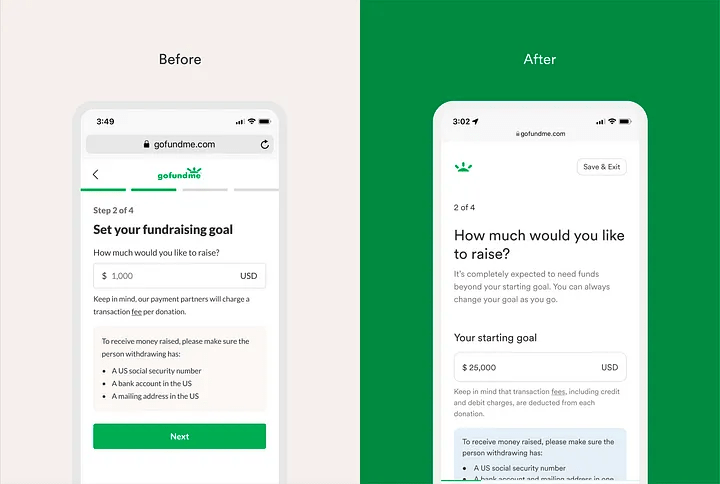
In order to create a more approachable experience, the team re-evaluated some of our commonly used design elements. This led to more accessible typestyles, softer shapes, and warmer colors throughout. Our language updates aimed to comfort and guide our organizers, similar to a conversation one might have with a supportive friend.
A closer look at our most significant design changes
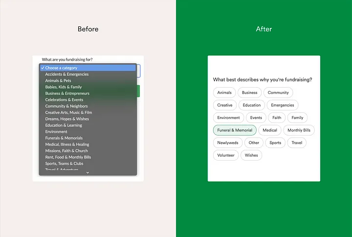
Category redesign
Our goal here was to lower cognitive load by removing the drop-down menu and simplifying the categories. Arranging them next to each other made for a much less overwhelming interaction. In testing, we found 60% of respondents preferred the redesign of categories versus 40% for the dropdown design. Additionally, 68% of respondents preferred the alphabetical order of the categories.
Empathy takeover
What we’ve named “the empathy takeover” is a reassuring message that appears over a series of three screens after organizers have selected the funeral and memorial category. Starting a fundraiser may be an emotionally difficult task after a loss, so we created this moment to acknowledge the situation and reassure organizers that we’re here to help them through the process.
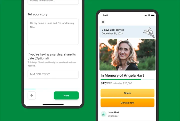
Funeral service date
We incorporated a funeral service date feature as a way for donors to understand when funds are most urgently needed. One glance at the fundraiser page immediately gives donors this information, while also providing a layer of transparency that can inspire more trust. The benefit to organizers is twofold: It gives them more control over what they’d like visible on their fundraiser, and it removes the burden of communicating this timeline to donors themselves.
More empathetic language throughout
In this tailored experience, it was crucial to design a conversation that was as emotionally supportive as it was functional. We did this by making subtle but meaningful changes in tone, like switching from commanding statements to questions where it made sense, and shifting the focus away from the organizer to the story of their loved one.
We also re-examined specific fundraising language across our platform, with the goal of making it warmer and more inviting. On the fundraiser page, for example, the section where donors can leave messages for the organizer was renamed from “Comments” to “Words of support.”
Looking ahead
We’ll be rolling out the new funeral and memorial experience to our community internationally over the following weeks and months, and we’re excited to introduce even more changes, like recommended goal amounts to help organizers feel more confident in their request for donations. Our long-term vision is to create tailored guidance across all of GoFundMe’s fundraising categories.
As we continue evolving and creating new product features that center our mission of helping people help each other, one fact remains certain: Empathy will always be on the roadmap.